Don't hate on tutorials


“Press B to Crouch” under the obviously placed fallen ceiling. Remove your abilities to show you how to aim your gun. Wrest the camera control away to show the low cover you’re meant to be hiding behind. ‘Onboarding’? Vomit. Usability is a mark of all that is bad about modern game design. It undermines all the best things about games, sanding off their edges, taking autonomy away, designing for the lowest common denominator. Right?
Nope. “I’ve never met anybody yet who only wanted ten people to play their game,” says Graham McAllister, founder of Player Research, a playtesting and user research specialist for games. “These are passionate people who want as many people as possible to love their game.” Usability is one of the more misunderstood elements of game design. It doesn’t strangle challenge, depth and imagination. In fact, it’s meant to do precisely the opposite.
If you played Minecraft back in its earliest years, you might wonder whether usability is essential to finding an audience. It dumped you in the wilderness with no pointers on what to do next or how, and you had to read guides or watch videos to know how to craft torches and tools and to build a house so you could survive your first night.

A lot’s been made of how this helped build Minecraft’s success. PC gaming is full of similar examples, and always has been. The games we value tend to be complex and experimental. Many, from DayZ to DotA, rose out of modding scenes, evolving their own conventions for interfaces and progression systems and forcing players to learn them for themselves or to dive into forums and YouTube. Objectively, they are usability hell, and yet they’ve led to some of the most popular games of all time.
So why should we care about usability? The answer is multi-layered, but first it’s important to note that we tend to forget the hundreds - maybe thousands? - of mods and indie experiments that didn’t get anywhere. Survivorship bias is a thing, and if you’re a developer wanting to make a living you’d be forgiven for wanting a little confidence in your game’s prospects. That’s why you don’t see big budget games attempting to do the same as Minecraft once did, and why Minecraft today has tutorials and help pop-ups to guide you through its opening days.

But a lot of players don’t think they need to be taught anything. “We observe that people believe they know a lot of the elements of the MOBA genre and that they’re good to go and they don’t need any onboarding,” Celia Hodent, director of UX at Epic Games, tells me. While working on Paragon, Epic saw that a lot of players knew its basic controls, but they didn’t know the mechanics. “If we don’t do anything, we leave a big part of our audience without help.”
When players don’t understand a game they tend to stop playing, and for Paragon, which is free-to-play, that’s bad. “We can make money if we retain players,” says Hodent. “We need to see what makes them churn, what makes them stop playing, and what we see through analytics is that people will churn when they’re dying to towers and not equipping cards. Most of these factors are what we saw in UX testing six months earlier, people not understanding Paragon’s particular subtleties. It’s our job to make players competent in playing the game.”
It’s tempting to think that the fun in games always lies in discovering things for yourself. In Minecraft perhaps that was true, and it’s certainly part of its overarching themes of exploration and creativity. But it doesn’t fit quite so well for other genres. “When we speak to people who like deep strategy games, they say that lot of the time the fun comes from how to put the things you’ve learned together,” says McAllister. But if you haven’t discovered the constituent systems and units to combine, or simply don’t know how to, you’re missing out on exploring the depths of the game and finding what really makes it fun.
McAllister sees three layers to a player’s engagement with a game. First they need to understand what’s going on. Second they have to know how to do the things they understand. The final layer, the good bit, the game bit, is what he calls the ‘user experience’: playing with knowledge of both what to do and how to do it. Grappling with getting players to get through these stages and find the fun is a big part of what a developer is doing when they’re polishing a game. “Most people think that polish is visuals or art or audio, but polish is really: are people playing the game in the way you want them to? Is there any unintended friction?” he says.
“Game usability is about not having the game system get in the way,” says Katherine Isbister, professor in computational media at the University of California in Santa Cruz and author of various game design books on usability. “It’s like you’re suiting up to climb Everest. You don’t want your gear falling apart on you. If your equipment fails, that feels quite unfair, but if you fail to climb to the summit on your own merits, that can all be in good fun. That’s the difference.”

After all, one of the big misunderstandings around usability is that it’s not about making games easier. “Dark Souls is a very usable game,” says McAllister. “It teaches you exactly how the rules work and it’s brutally difficult and that’s fine. It’s what the designers want. They tell you exactly the rules of the game, and it’s up to you to beat that.”
Isbister puts it this way: “The thing about tutorials is that you’re not just teaching someone how to play the game, you’re teaching them how to have fun playing the game.”
“It’s our job to make players competent without being bossy,” says Hodent. “And this is what’s difficult to do.” The things that many players hate in tutorials, like the game taking control away to show you some new feature or screens of text instructions, are equally hated by usability experts. Instead it’s about contextual instructions, showing by placing a player in a situation and giving them the information they need to deal with it and space to learn. Picture the room with a low wall that slows or stops the zombies as they shuffle towards the player.
 Something games really shouldn’t do is something like Driver’s forced carpark tutorial, where you have to perform various manoeuvres with a goddamned time limit to get to the actual game.
One of the best tools is ‘affordance’, which is to design elements of a game in such a way that they naturally suggest to players what they should do. The stone path that leads to the next important area; the lighting that guides the eye to the button that opens the door; the scrapes on the floor that indicates a crate can be pushed. “The more good affordance we have and the more polished the signs and feedback are, the less we need bossy tutorials,” says Hodent.
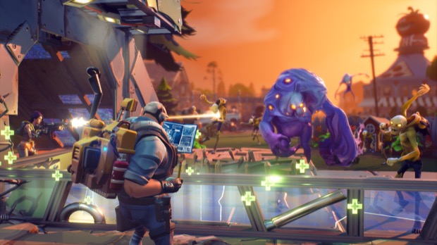
Affordances can work the other way around, though. Early in Fortnite’s development, Epic’s designers decided that players would use just one tool, a pickaxe, to harvest all materials from the environment. But Hodent and her team realised that when test players encountered an axe, which was one of the game’s melee weapons, they expected to use it to chop trees. “It’s not the player’s fault, it makes sense, so in that case we removed the axe to avoid confusion and some bossy and counterintuitive tutorial.”
“You have to think about your onboarding process early on,” she adds. “When we see pretty late that there’s a problem, you end up having to do quick fixes, such as taking control over the camera and showing something or having a wall of tutorial text pop up.”

Usability sits right in between empirical study and subjective design. It’s based on careful observation and hypothesis-making, but it deals with messy human nature. One issue Fortnite’s developers faced was around an ability that would allow players to harvest faster if they could hit a key when an icon flashed. The problem was that players didn’t understand the icon. They thought it was some kind of feedback, not a prompt for action. Epic tried changing the icon’s colour and placement on-screen to little avail, and in the end they solved it by making the ability an unlock in the skill tree. In highlighting it as a desirable skill, they finally drew attention to what it was and players understood it.
“Making games is just so damn hard, and integrating usability into the process adds another layer of trickiness,” says Isbister. “Some companies do it better than others, but if the team is really struggling and they’re over-time and need to scope down, they can’t always deliver the usability they would like.”
Many of the things that can be so annoying in games are not when usability has attempted to smooth them out, but when usability has gone out the window. As experienced players, it’s easy to forget the moments of frustration when we were first playing. This is the territory that usability is taming, the wasteland between designer intention and player experience. You shouldn’t always have to hack through it to get to the fun.